Announcing insights: granular breakdowns of what’s happening in your fleet
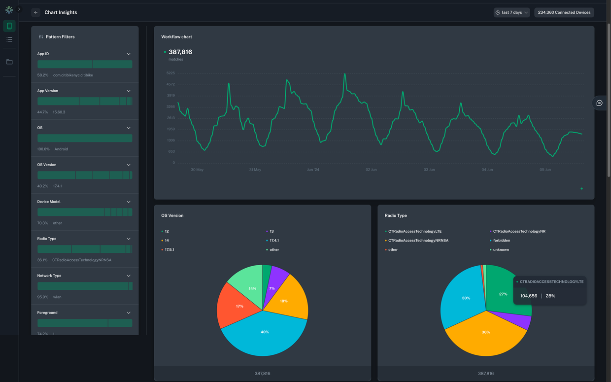
Today we are super excited to announce the newest feature in bitdrift Capture: Insights. Insights provides detailed visualizations and breakdowns of what's happening in your mobile fleet, all built on top of bitdrift's radically cost effective and high-vis approach to mobile observability. Interested in slicing and dicing app versions, mobile phone models, connected network types, and more? We got you covered!
At bitdrift, we have a very different take on observability: on-device intelligence. Instead of sending loads of expensive telemetry data only to later sift through it for a few precious insights, we couple a sophisticated device SDK, local storage, and real-time control via our control plane SaaS, in order to dynamically fetch only the data that is needed in order to understand customer behavior and solve problems quickly. We give you 1000x the observability at 0.01x the cost.
When we originally launched Capture, we supported explorations and workflows, session recording, and charting over synthetic metrics. Later we added support for dynamic funnels. While incredibly powerful, the thing that has been missing is the ability to deeply understand the attributes of the users that are hitting certain sequences of events.
Imagine you are running an experiment and want to understand if the experiment treatment is seeing an elevated level of error logs or app hangs. You can do this analysis dynamically using Capture today. However, let’s say that we see elevated error logs for the treatment. What next? We can manually look through example sessions which might give us clues, but typically we also want to know other things about the users that are having elevated errors: which app versions are affected? Are there any commonalities in mobile device models? What about OS versions? Knowing and visualizing these breakdowns is invaluable in deeply understanding the shape of a problem and working towards a solution. Insights adds exactly this functionality!
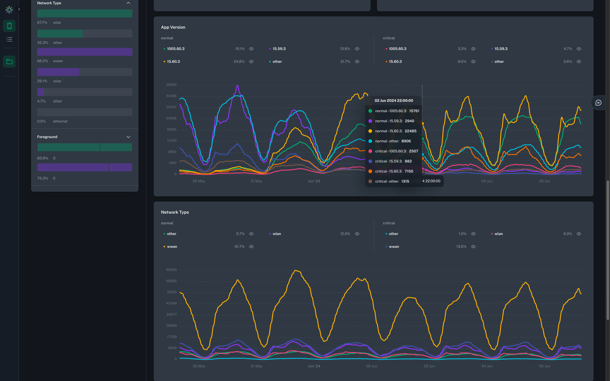 Starting today, for every plot series action, we will also show user attribute insights along with the resultant chart. This will allow slicing and dicing the data across the following axes:
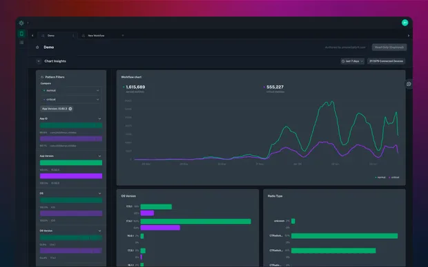
 Insight charts support a variety of different visualization types including bar, pie, and line charts. Additionally, comparison between different plot lines is also supported. For example, given a workflow that generates two discrete plot lines, one for control and one for treatment in an experiment, population comparison is now possible between the two populations that match each workflow branch. Continuing with our example from above, by comparing control and treatment, it may become immediately obvious that the problem is specific to a particular mobile OS or device model.
Capture is changing the mobile observability game by adding a control plane and local storage on every mobile device, providing extremely detailed telemetry when you need it, and none when you don’t. If lack of detailed user attribute analysis was keeping you away, now is the time to give us a try!
Interested in learning more? Check out the sandbox to get a hands-on feel for what working with Capture is like and then get in touch with us for a demo. Please join us in Slack as well to ask questions and give feedback!

- Application ID
- Application version
- Foreground status
- Device model
- Device OS
- Device OS version
- Current network type (WiFi or cellular)
- Radio type (2G, 3G, etc.)
- Locale
