PricingDocs

Announcing advanced charting and histograms, oh my!

Today bitdrift Capture just got monumentally more powerful: you can now create sums and group bys via log field extraction, rates (like network success rate), and get this, fleet-wide accurate histograms of metrics like P90 request latency grouped by URL endpoint. These new charting types give mobile developers unprecedented visibility into their fleets, so you can build better, more resilient apps faster. Let’s dive in!
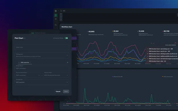
advanced charts configuration with a preview of the output
At bitdrift, we have a very different take on observability: on-device intelligence. Instead of sending loads of expensive telemetry data only to later sift through it for a few precious insights, we couple a sophisticated device SDK, local storage, and real-time control via our control plane SaaS, in order to dynamically fetch only the data that is needed in order to understand customer behavior and solve problems quickly. We give you 1000x the observability at 0.01x the cost. Our existing charting over synthetic counter metrics feature allows answering the question: how many times does an interesting event happen (as represented by a log line in your app)? Effectively we only allow counting events, and rely on our matching system to determine which events to count. While very powerful on its own, there are many questions that can not be answered by this system. For example:
  • Count the sum of a specific numeric field inside an event. For example, if a log line contains a field called bytes_written we might like to extract and show a sum of all bytes written across devices.
  • Display the rate of two different synthetic metrics. For example, showing success rate as defined by the number of successful requests divided by the total number of requests.
  • Group a sum or rate via a group by label and then show the top groups. For example, showing the URL endpoints that send or receive the most data or the URL endpoints that have the largest failure rate.
  • Displaying histograms (percentiles) of data such as request latency, disk usage, and other things that are not counters. Typically in this case we want to see accurate percentiles across P50, P90, and P99 to allow a deeper understanding of median and tail performance.
As of today, all of the above questions can now be answered, in real-time, via Capture.

Sums and group by

Instead of simply counting matching events, our advanced charting mode can now extract numeric fields out of log events and sum them. This monumentally increases the utility of synthetic metrics by allowing them to not only match events, but to also extract data within those events. Furthermore, we allow extracting a “group by” label to associate with the sum or count. Using the group by label we are able to dynamically show the top sums given all groups. In the above workflow screenshot, we are counting network responses with a status code >= 500 and also grouping by the URL endpoint. We then show the top endpoints as defined by the number of failures.

Rate

Sometimes the sheer volume of failures charted in the previous section doesn't paint the whole picture: enter rate. The advanced charting mode is also capable of plotting a rate (ratio) between two independent time series. This allows for plotting things like network success rate over time. In the above workflow screenshot we are counting both the total number of requests as well as the number of successful requests. With this information we are then able to show a percentage based success rate chart, including trends over time.

Histograms and group by

Before diving into Capture’s new support for histograms let’s briefly recap what histograms are and why they are important. Fundamentally, histograms are a visual representation of the distribution of data. Given many numeric data samples, the 50th percentile (or P50) would be defined as the value where 50% of samples fall below and 50% fall above. Similarly, for P99 99% of samples would fall below while 1% would fall above. Histograms are very important for understanding certain types of computing behavior such as network latencies, UI drawing latencies, time to first interaction (TTI), disk space usage, and many, many other things. Without getting way into the weeds (we will have a follow up technical post that will get way in the weeds, don’t worry), suffice to say that computing accurate histograms across very large and distributed populations is very difficult. Why is it difficult? Think about a naive algorithm to accurately compute P50: you would need to collect every value, sort it, and then take the median data point. This is clearly not practical at scale! For our histogram launch, we have developed a histogram ingestion pipeline that can accurately compute percentiles across your entire mobile population. This means that when we tell you the P99, we are giving you a very close real approximation of P99 across every mobile device. This is different from say computing the P99 on each device, sending it, and averaging those points and then claiming that is P99. It is not! We don’t stand for inaccurate percentiles when making business and operational decisions and neither should you! Continuing with our network failure example from the previous sections, failure rates by themselves are not helpful if you can’t root cause the failures. DNS latency and timeouts are a common source of errors so in the above workflow screenshot we are recording the DNS resolution latency for every network request. This information is sent and aggregated and the chart is showing accurate P50, P90, and P99 across the entire fleet over time. Histograms also support group by so it’s possible to show the top groups for a given percentile. This would allow showing the URL endpoints that have the highest response latency, for example. Wow!

Come and get it

Capture is changing the mobile observability game by adding a control plane and local storage on every mobile device, providing extremely detailed telemetry when you need it, and none when you don’t. If lack of advanced charting and accurate histograms was keeping you away, now is the time to give us a try! Interested in learning more? Check out the sandbox to get a hands-on feel for what working with Capture is like and then get in touch with us for a demo. Please join us in Slack as well to ask questions and give feedback!

Stay in the know, sign up to the bitdrift newsletter.

Author